Completion Date:
Project Overview
Death is a thing that happens every year, no matter what death is always going to occur. This report will give a better understanding of how long you can live in different times and places throughout recent history. This powerful Power BI report dives into the different regions of the world and showcases the places you could go and expect to live the longest while also showing if the expectancy is growing or shrinking. On top of that, you can see the rates of some of the major causes of death such as alcohol, measles, hepatitis B, etc. This project also contains dynamic KPIs that will tell you the average life expectancy for whatever region/time you choose and the YoY % of said choice by color and symbols. The charts in this report also work dynamically allowing you to visualize your data and drill down to specific regions for a better understanding. One of these charts is a map that also contains a dynamic legend by color to see different categories of life expectancy. This project is a great way to gain more knowledge about life expectancy around the globe, and hopefully, maybe keep the number growing.
Role:
Problem Statement
According to the Proceedings of the National Academy of Sciences of the United States of America (PNAS), life expectancy at birth for both men and women increased throughout the 20th century. One example they give is the average Japanese woman who has the highest life expectancy at birth, above 87 years. In 1840, the record was held by Swedish women, with an average life span of 46 years. PNAS also states although life expectancy and life span equality have been positively correlated, it is apparent that the relationship is less strong and often reversed in recent decades, resulting in negative correlations in some countries in yearly and 10-y changes. This is why we must take a closer look into more recent times and see what we can do about this change.
Key Takeaways
Suggestions:
From the data, we can see that in regions that have more developed countries such as Europe and North America that the life expectancies are typically higher than in places such as Africa or Asia. From this knowledge and the data, I have 3 suggestions.
1. Diseases such as Hepatitis B and Measles are more common in underdeveloped countries and places like Asia and Africa have major increases of 120%+ over our 15-year time span of purely measles-related deaths . One reason for these numbers is that they may not have the same access to medicine which is leading to their lower life expectancy numbers. In order to combat this, we can send more money in aid to help these countries get the healthcare and tools needed to increase their numbers.
2. Another big reason smaller countries may have these smaller numbers is their food and water. Africa, which is said to have 1 and 3 people facing a water crisis, according to Brookings.edu, has the lowest life expectancy at 46.50 years in our data. Water can be very crucial to the health and well-being of a human, and without the proper drinking water, it could affect the way you live. Places like Europe and North America can help and already are by sending water and developing natural wells for the people of these places to use.
3. Alcohol we know is a very serious and dangerous substance. The data shows that alcohol ranks 2nd and 3rd place in countries such as Europe and North America respectively. A lot of deaths can be stopped if the levels of alcohol were dealt with maybe by a limit ban, limited beverages per customer, or maybe even a recognition/advertisement that alcohol is dangerous and can lead to deaths.
4. Going back to the article about the Japanese woman, we have come a long way in current times to help life expectancy. With more and more data coming out about life spans we can be more considerate of others well being and take others well being into consideration instead of just our own. If we fight our problems together we can help life expectancy numbers keep rising and be the highest they can be.

Deployment
Problems Encountered:
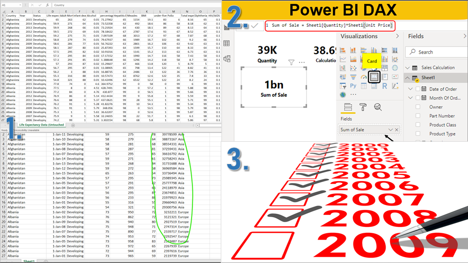
1. The biggest problem I ran into was fixing all the incomplete and wonky data, I had to fix most of it manually which took a long time.
2. I had some difficulties in my KPIs regarding inaccurate results with my YoY %. In the end, I managed to figure it out with a slightly complicated but effective DAX code.
3. My date column was not responding correctly. Whenever I tried to change the value type it would always result in an error in my data. I ended up receiving some helpful advice from my mentor and imported the data into SQL to change the value and then exported it back out to Excel.


